

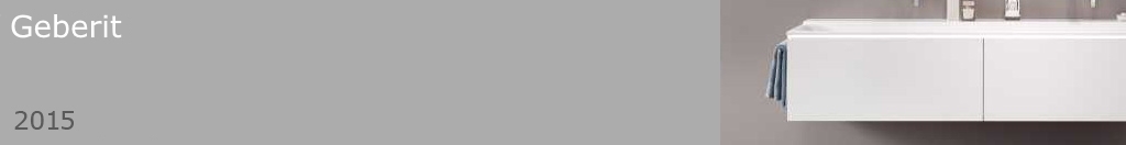
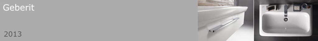
| 2017 | / | iF Design Award (product) | / | Geberit | / | Xeno2 |
| 2014 | / | RAS magazine 'Product of the Year 2014' | / | Geberit | / | Xeno2 |
| 2010 | / | Designpreis Deutschland Nominee | / | Koziol | / | Eve fruitbowl |
| 2009 | / | Designpreis Deutschland Nominee | / | WMF | / | Avance cutlery |
| 2009 | / | Form | / | Koziol | / | Eve fruitbowl |
| 2008 | / | White Star | / | Rosenthal | / | Free Spirit |
| 2007 | / | Reddot Design Award | / | Rosenthal | / | A La Carte |
| 2007 | / | Classic Design Award V & A | / | Rosenthal | / | A La Carte |
| 2007 | / | Designpreis Deutschland Nominee | / | Rosenthal | / | A La Carte |
| 2007 | / | Designpreis Deutschland Nominee | / | Rosenthal | / | Tatami, Scoop |
| 2007 | / | Design Plus | / | Rosenthal | / | A La Carte |
| 2007 | / | Design Plus | / | Rosenthal | / | Tatami, Scoop |
| 2006 | / | International Forum Design | / | Rosenthal | / | A La Carte |
| 2006 | / | Good Design | / | Rosenthal | / | A La Carte |
| 2006 | / | Maison & Objet Paris | / | Rosenthal | / | A La Carte |
| 2005 | / | Designpreis Deutschland Nominee | / | Rosenthal | / | Free Spirit |
| 2005 | / | Reddot Design Award | / | Rosenthal | / | Free Spirit |
| 2004 | / | Good Design | / | Rosenthal | / | Free Spirit |
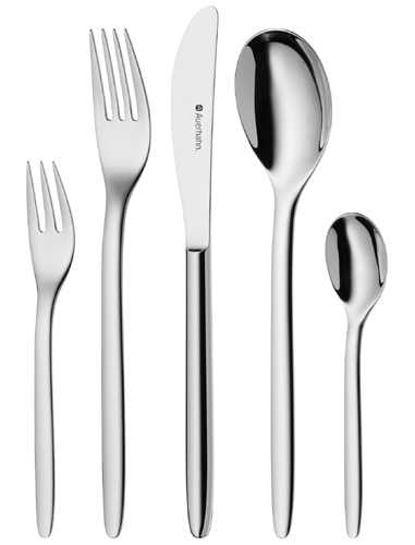
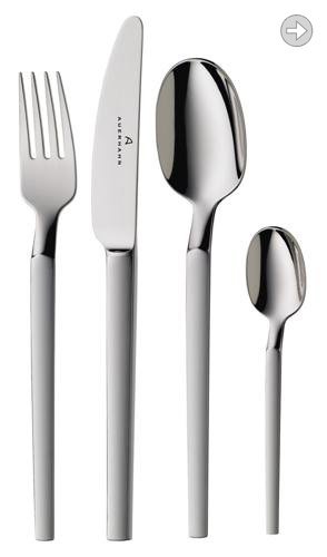
| 2002 | / | Reddot Design Award | / | Auerhahn | / | Korb |
| 2001 | / | Form | / | Rosenthal | / | Yono |
| 2001 | / | International Forum Design | / | Rosenthal | / | TableWear |
| 2000 | / | Form | / | Rosenthal | / | Spirit |
| 1989 | / | New Designers | / | National Competition | / | Gemini Chair |
| 1988 | / | Gordon Russell Trust Award | / | National Competition | / | Manta Chairs |

|
Robin Platt graduated from London College of Furniture. The same year he won the New Designer Award with his degree work. This was a cast aluminium chair that went on to be manufactured in Spain. This early success fuelled his desire to operate as an independent designer. He then founded a studio in London with architect Cairn Young where they spent time developing their ideas and skillbase. When they finally emerged again into the big wide world they headed to Milan as the chosen starting point. Fortunately Sawaya & Moroni were enough enthused by their energy to put them on the map by producing a series of products from 1997. Using this as a springboard they crossed the road (Via Manzoni) and met with Enrico Astori at Driade. This was the beginning of the first industrialized products for Platt & Young. In 1998 a silver fruitbowl produced with Sawaya & Moroni proved to be the introduction to Rosenthal in Germany. This was the beginning of a move towards product design and tableware. Their first collection together was called Spirit and it was launched in 1999 in Frankfurt. As their exposure became more focused on the Ambiente trade fair in Frankfurt, they began to work also with WMF, specialising in cutlery design. Rosenthal, WMF and Koziol have become longstanding associations, with whom there is always a very good dialogue. In 2001 Robin made a lifestyle decision and moved to deep rural France in the Pyrennes with his wife and four children. At this point he and Cairn began to design under their own names as well as still in collaboration. 2004 saw his first significant solo project when he designed the Free Spirit table service celebrating the 125 year anniversary of Rosenthal. This turned out to be very successful and span off into various other directions such as the new Lufthansa Business Class tableware introduced in 2009 and has also been graced with various Versace decorations. Having returned to England in 2005 Robin has worked from a studio that is attached to his home in Bury St Edmunds in Suffolk. Products are developed in the studio either to a direct briefing, or there are always ideas being developed to the point at which they are ready to be shown to a potential licensee. In either case there is a close collaboration with the manufacturers R & D department. Robin's work for Rosenthal can be now be found in the permanent collection at the V & A museum. |
|

|
Robin Platt South Hill House 43 Southgate Street Bury St Edmunds Suffolk IP33 2AZ UK info@robinplatt.com |

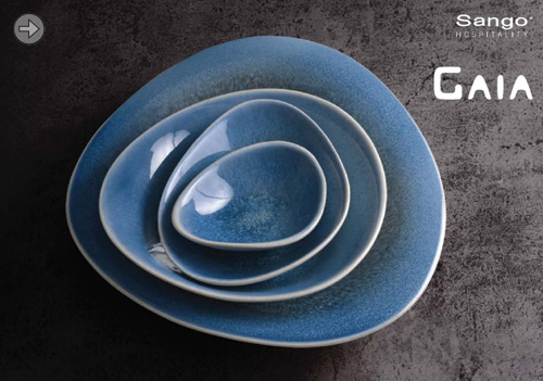
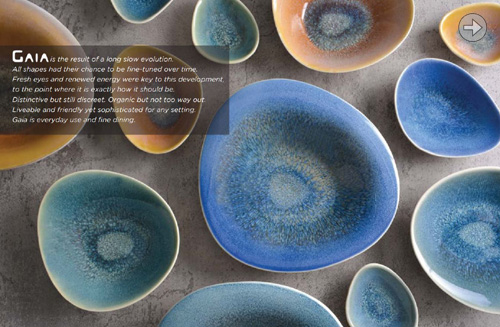
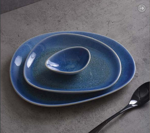
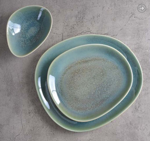
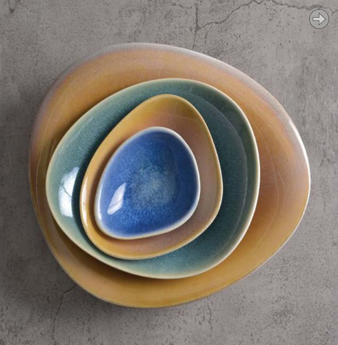
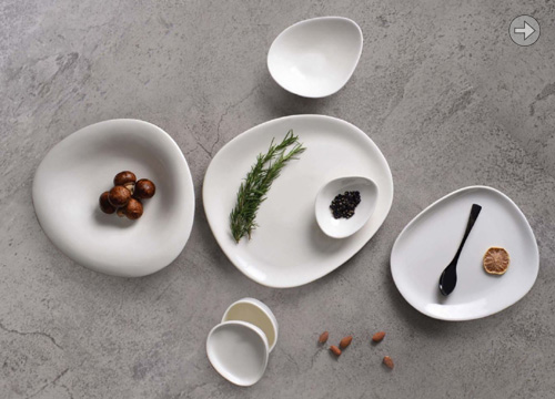
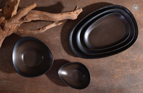
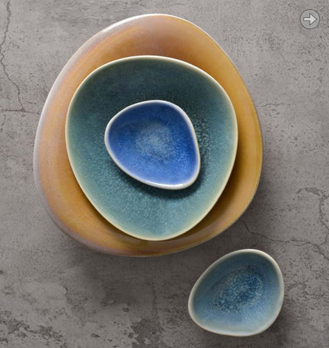
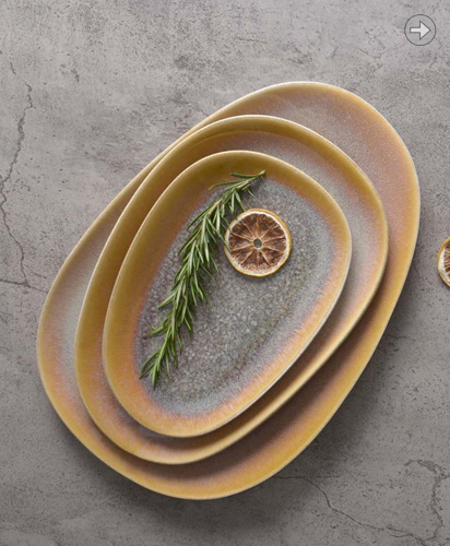
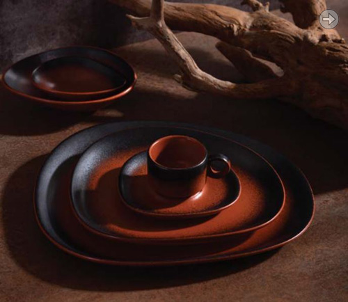
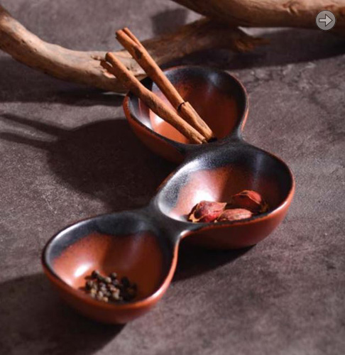
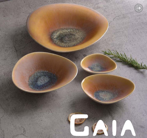
| GAIA is the result of a long slow evolution. All shapes had their chance to be fine-tuned over time. Distinctive but still discreet. Organic but not too way out. Liveable and friendly yet sophisticated for any setting. GAIA is everyday use and fine dining.
|

|
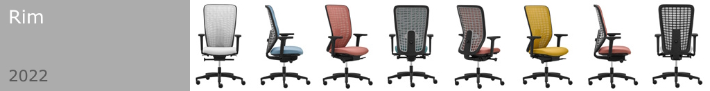
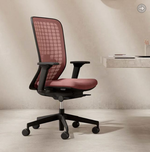
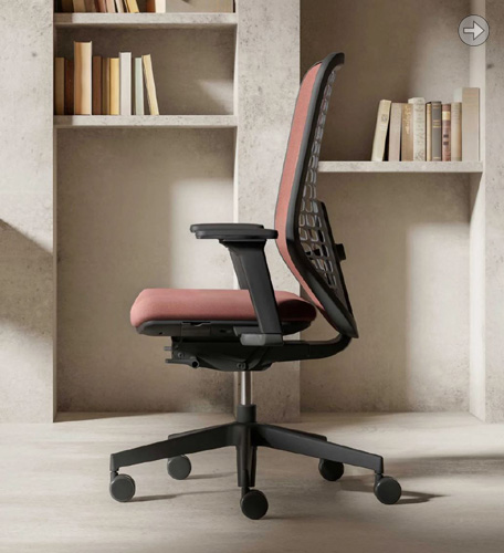
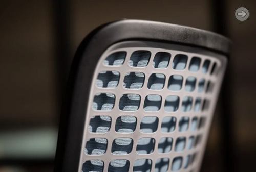
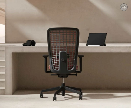
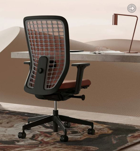
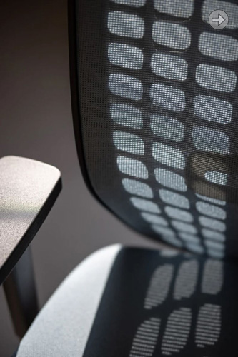
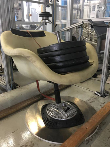
| Space is a premium office task chair that now sits at the top of the Rim swivel chair pyramid. It is the happy result of a well spent second lockdown which gave me time and space to go through many iterations of design process to arrive at this quite striking 2-tone backrest assembly. https://www.rim.cz/en/ https://www.rim.cz/en/designers/detail/robin-platt-(gb)/
|
|
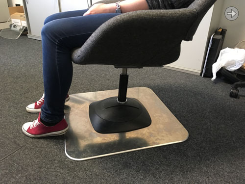
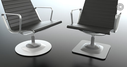
| I have begun a long journey into the office seating area of design. My first product is CP2 which is a mechanism that provides an entirely new movement. The principle is a back and forth rock on a bridge which places the pivot to a virtual point beneath the ground. Coupled with a swivel that keeps the chair in line with the rock we have a super smooth feel. CP2 can be used by customers with any lounge chair and mounted on a base of their choice.
|
|
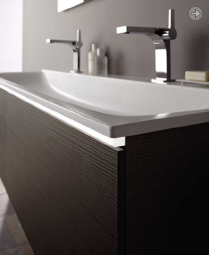
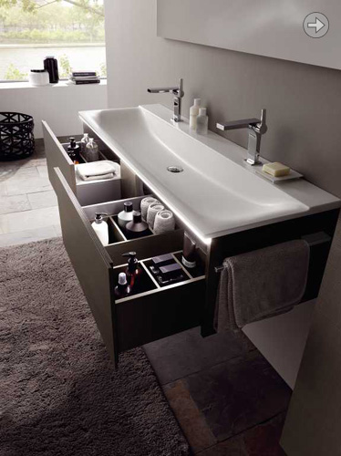
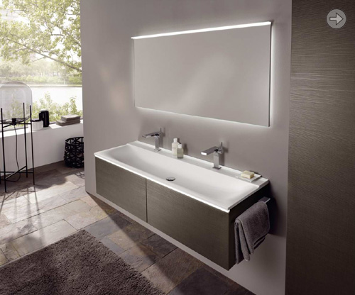
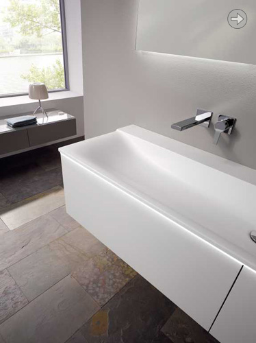
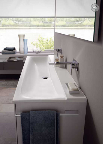
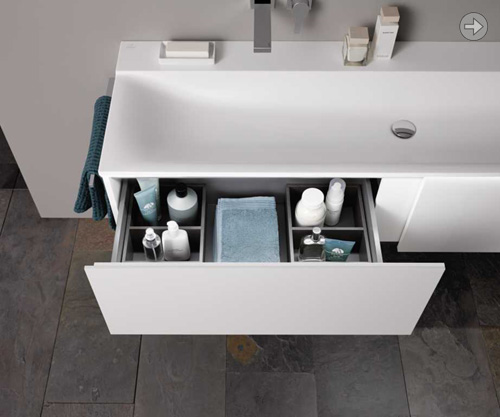
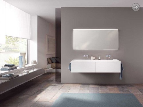
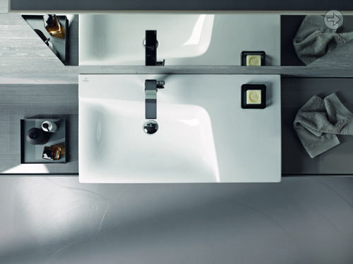
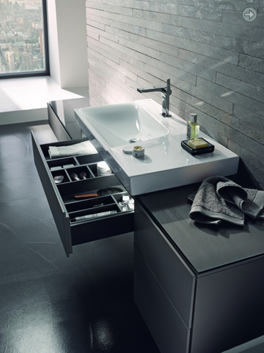
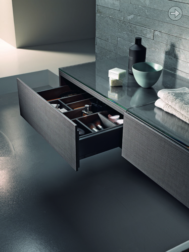
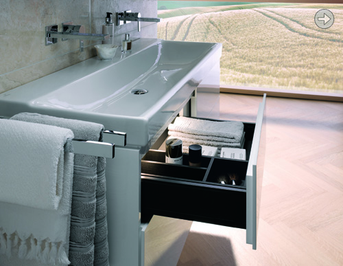
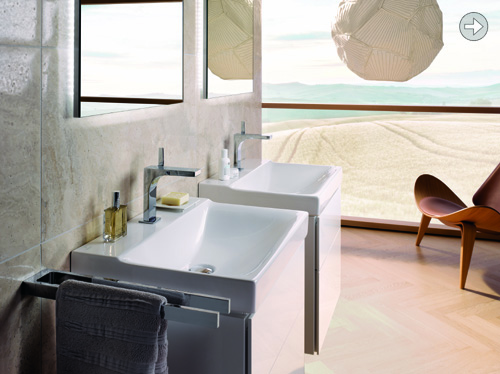
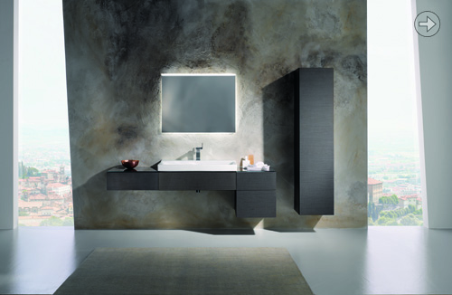
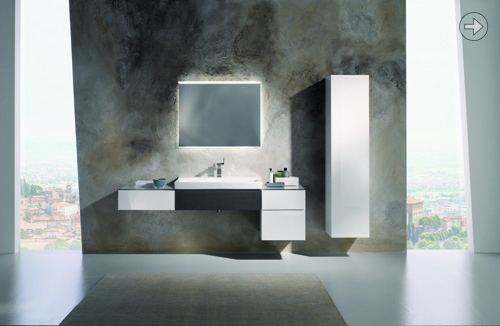
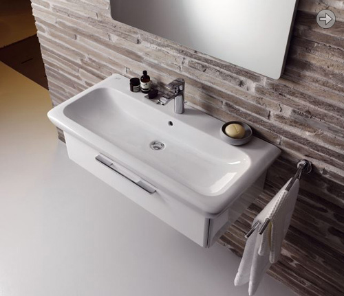
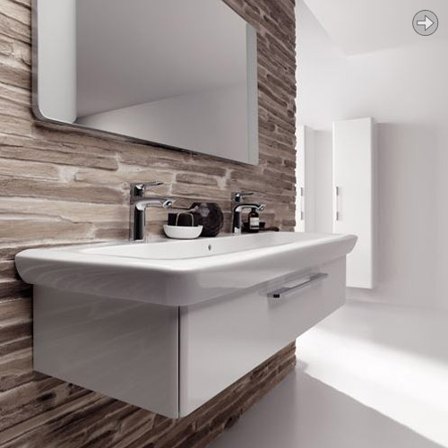
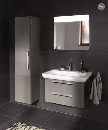
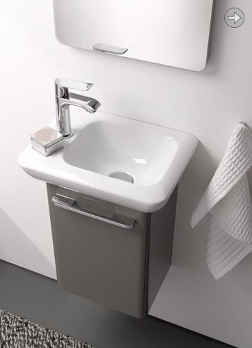
| The Xeno2 series has been extended with this Varicor version available in two sizes, 1600mm and 1400mm. Long and luxurious, with a thin edge only achievable with this solid surface material. We have added a slimline LED light just beneath the washbasin, with the drawers using the same high quality soft close mechanism as the original.
|
|
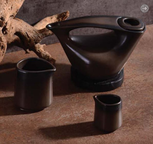
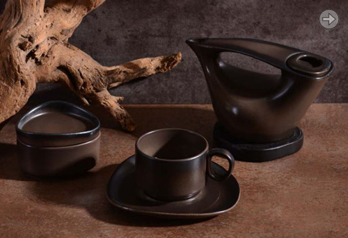
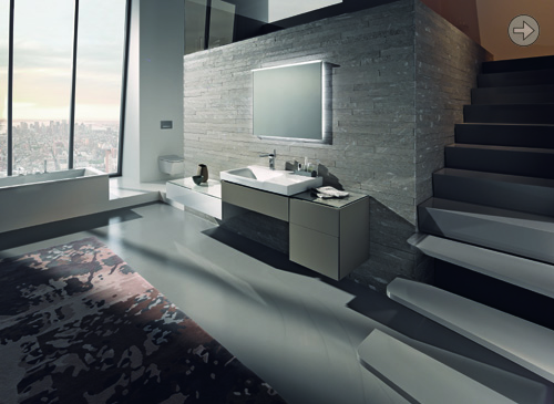
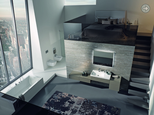
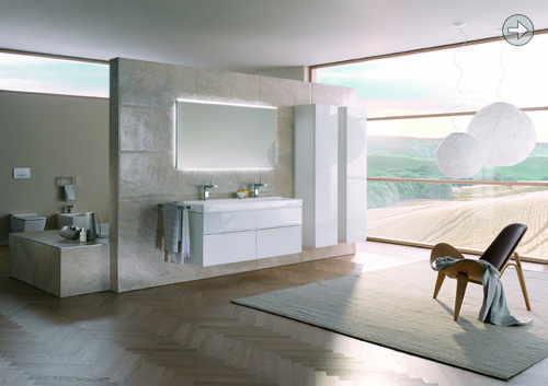
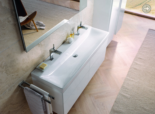
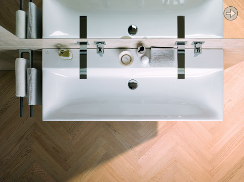
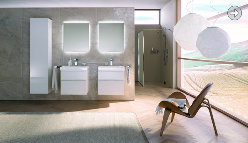
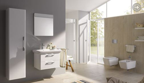
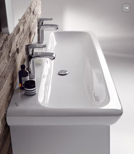
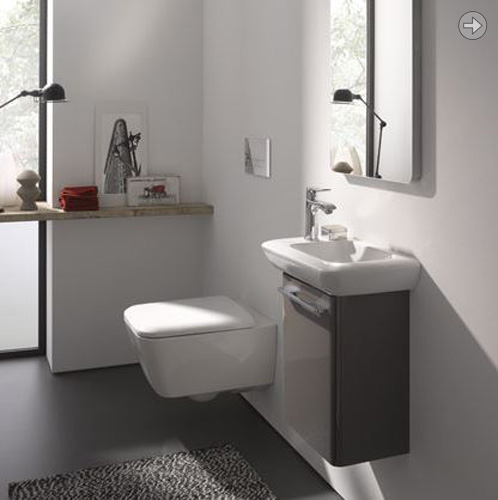
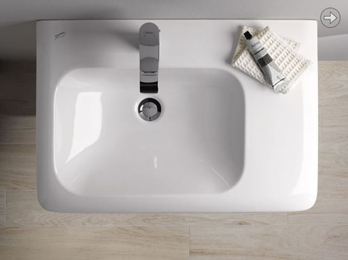
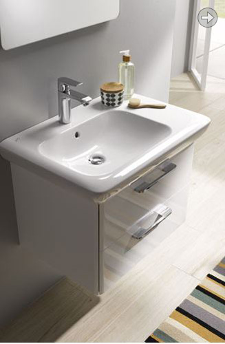
| Xeno 2 is a fusion between an architectural building block and a surprisingly soft organic. Within strict geometric lines, the soft bowls appear as if hewn into granite by a sculptor's hand. The small step up to the tap area adds subtle distinction between wet and dry. This is combined with finely detailed furniture elements to create a distinctive ensemble.
|

|
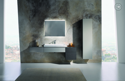
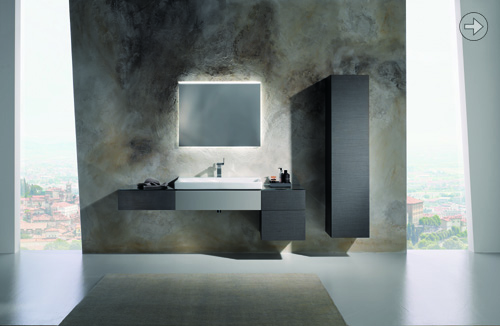
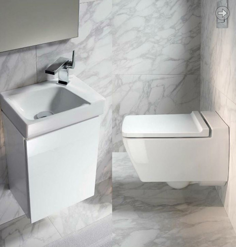
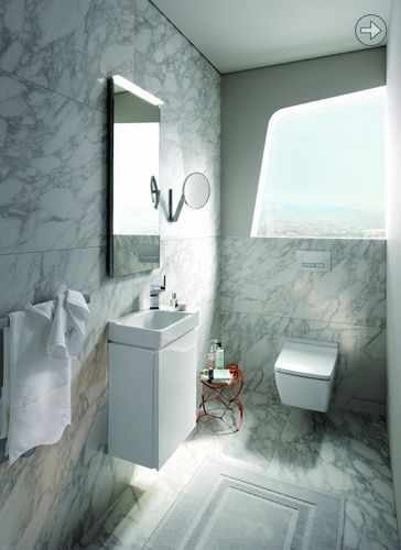
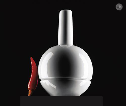
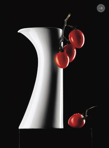
| 'it!' is a modern soft geometric form, with careful balance of proportions within the ceramics, and also in the relation of ceramics to the furniture. The soft 'facet' on the top edge gives it a distinctive quality, whilst being neutral enough to fit with many interiors. Geberit is the leading bathroom ceramics specialist in Europe. 'it!' is being sold through Keramag, Pozzi-Ginori, Sphinx, Twyford, Kolo and Allia/Selles.
|
|
| Slide is designed to have an elegant and simple design made accessible in the 'lower/mid price range.' First models were more expressive, but we tailored the original to a more neutral language to fit the requirements. Should stand the test of time....
|
|
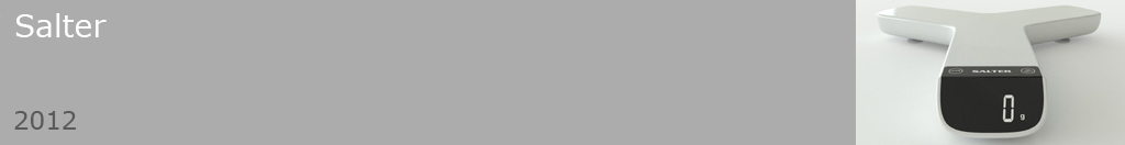
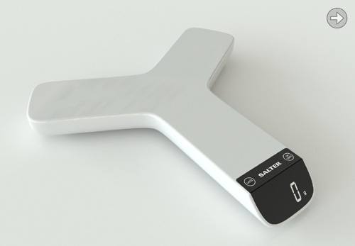
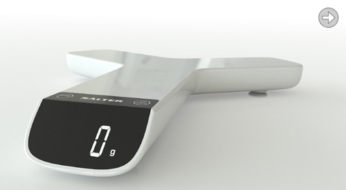
| As most electric kitchen scales are round or square it seemed appropriate to seek another shape for Salter. This 3 pronged design will accommodate all sizes of plates/bowls, whilst seeming to take up less space on the table. The display is at 45 degrees and therefore easy to read. Small enough to stow away in a drawer, but cool enough to want to leave hanging about.....
|
|
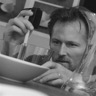
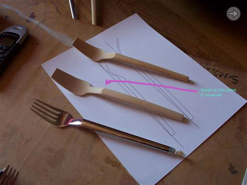
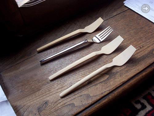
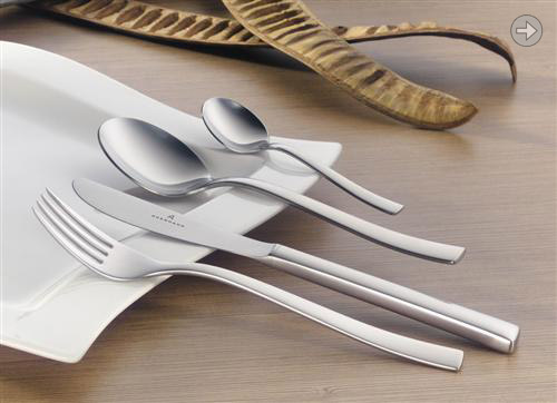
| Pulse was first presented some years back, and after undergoing various refinements it was finally introduced in 2010. The cutlery development process is close to my heart as it still involves models that are carved out of wood. In a workplace where 3D computer modelling is dominant, I like to get back to old habits with cutlery and use my hands. Some examples of the development process are shown in the pictures.
|
|
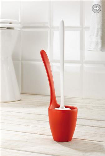
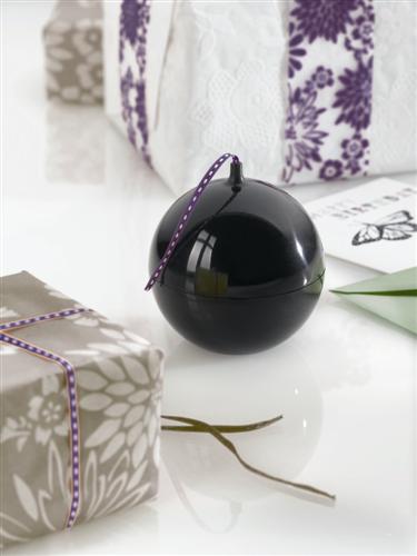
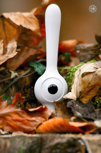
| Another toilet brush for Koziol. First there was 'Toq' released into the world in 2002. This time the thinking was to create something aesthetic and ergonomic. The beauty of Mary Loo is that it can be moved or emptied (ugh!) without ever getting your hands near the dirty bits. Actually this is not to be underestimated!
|
|
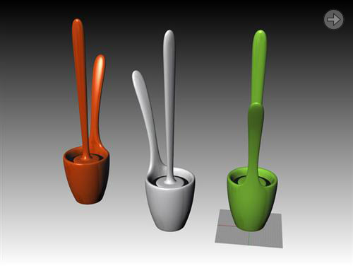
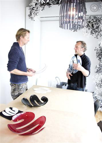
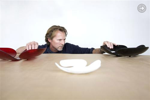
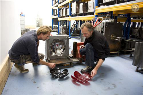
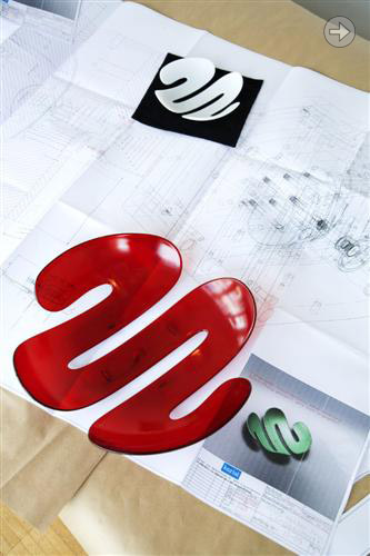
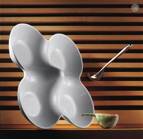
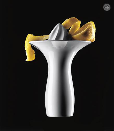
| With this fruitbowl I took great care to shape it in such a way that it looks organic rather than geometric. There are no true radii on the outline which gives it that 'sketched' look. In the photos the tug-of-war is with Stephan Koziol, and in house designer Juergen Diehl features in others. These were taken during a factory visit in the summer of 2008.
|
|
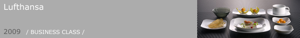
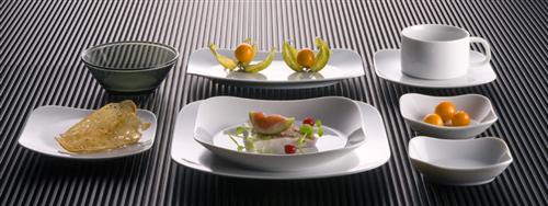
| Free Spirit struck again when it caught the eye of Lufthansa. At Rosenthal we customised the shape to suit the needs of airline catering and it is being rolled out over the years into the Business Class. It is currently to be found on long-haul routes.
|
1/1 |
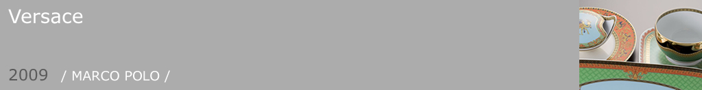
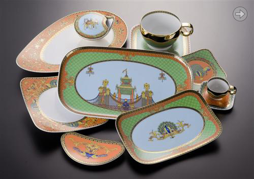
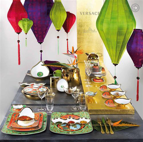
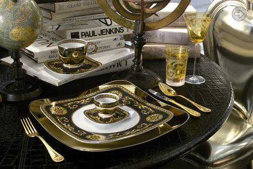
| Versace went back to a pattern from 1993 depicting Marco Polo's journeys, and asked Rosenthal to adapt it to fit with Free Spirit. This atmospheric and evocative pattern once again shows the pleasing harmony between a modern form and Versace.
|
|
| Desktop string dispenser that looks like something out of the Pink Panther. It comes apart with a short twist and can be filled with string or ribbon. Anything that can control the potential chaos that is a ball of string is a worthy object...
|
1/1 |
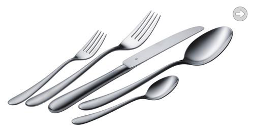
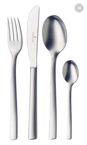
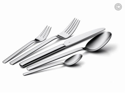
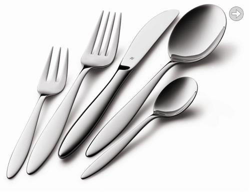
| Of all the cutlery patterns to date Avance was the most defined briefing from the outset. We set out to target an area that was both classical and sophisticated, but with some subtle detailing to set it apart. This has been achieved with a triangular section through the neck of the fork and spoon and the use of a satin finish. This pattern is about to be produced in 'Cromargen PROTECT' which is the new scratch resistant wonder material from WMF. Design: PLATT & YOUNG
|
|

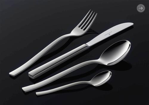
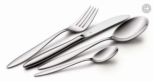
| The distinctive element of Carve is a slight torsional twist along the whole length of the fork and spoon handles. Not so visible in a photograph, but appreciable once in the hand. This is a very ergonomic cutlery with a designer look that doesn't shout too loud.
|
|
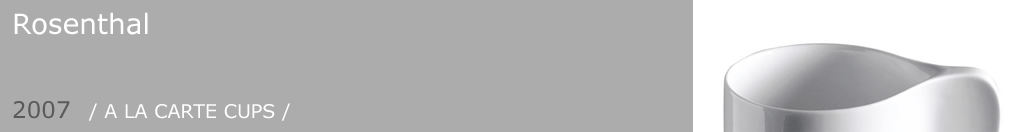
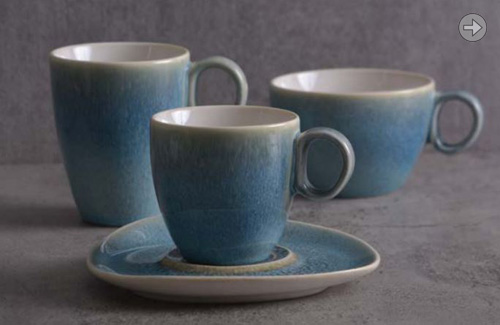
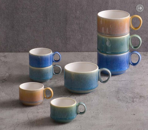
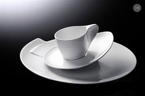
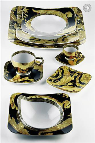
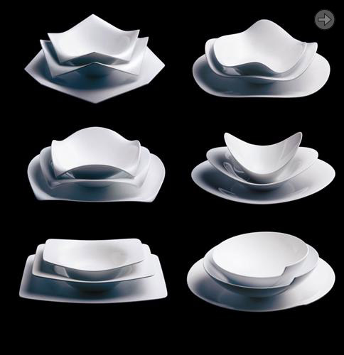
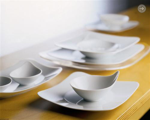
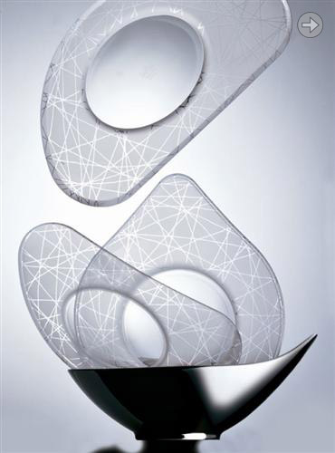
| Following the successful plates and bowls of A La Carte we created a cup collection to go with Scoop and Tatami were the two of the six shapes to be awarded complementary cups, five sizes of cup for each shape. There are some interesting shapes waiting in the wings for the other four members of A La Carte which might appear one day! Design: PLATT & YOUNG
|
|
| Free Spirit was chosen as the new shape from Studioline to be graced with the Versace magic. These rich and evocative patterns work very successfully on this more modern form.
|
|

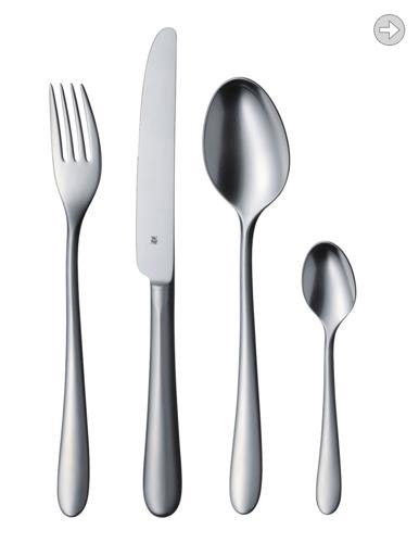
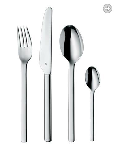
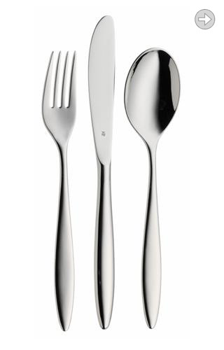
| This was my second WMF cutlery, and by chance it too was for the lower price level. Designing any basic model has its own challenges, and I guess Dune and Porto fill two slots with non-conflicting design languages. Dune is about as neutral as you can get, but retains the WMF pedigree with confident and unfussy proportions.
|
|

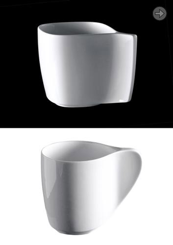
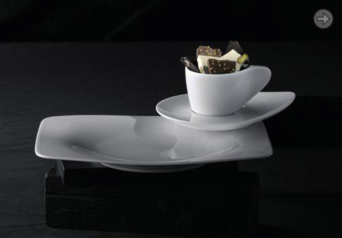
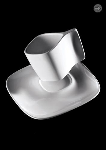
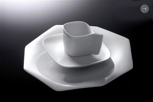
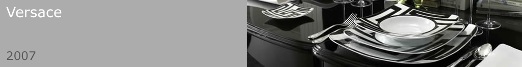
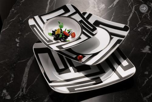
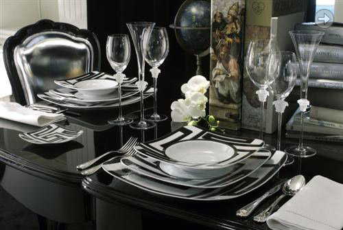
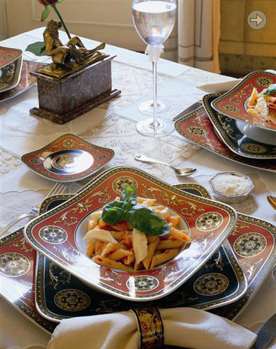
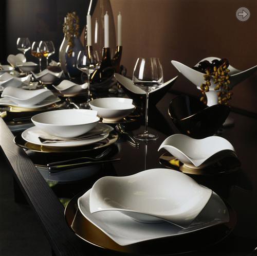
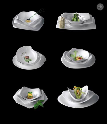
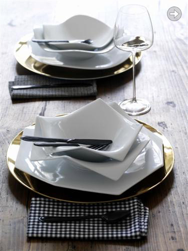
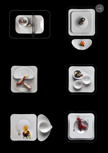
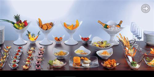
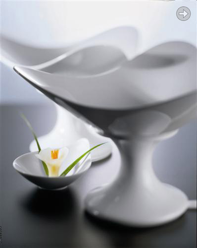
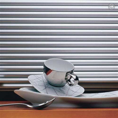
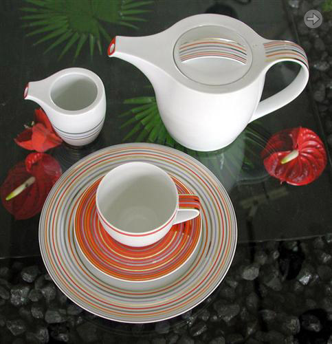
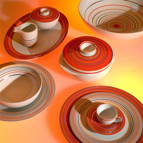
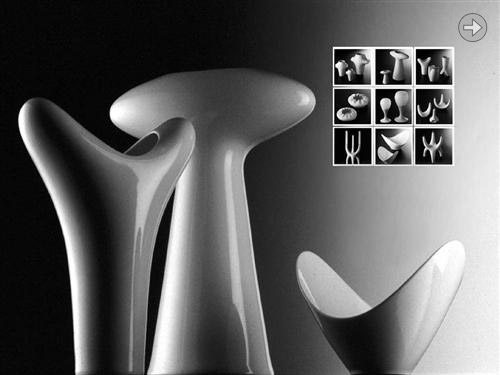
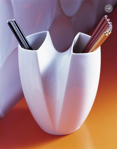
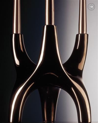
| With this concept we went for something completely new to modern dining. We designed six completely different, but compatible shapes, and we offer them as a collection that can be used with all six shapes on the table or, as the name suggests, you buy only the one or ones that you like best and use those 'A La Carte' As rich and varied or as simple and straightforward as you wish for your table. This was another collaboration with Cairn Young, and alongside Robert Suk from Rosenthal we really had a lot of fun. The six forms you see are the tip of the iceberg. We must have designed at least thirty shapes before settling on these six! Design: PLATT & YOUNG
|
|

| A significant moment for me. My first WMF cutlery! I guess this was my biggest learning curve, as my first effort of this design was a very over-exaggerated version of the same. Huge bulbous curves, almost cartoon like. Then one night, fortified with enough red wine I attacked my models with my tools and reduced the overall bulk to this much more refined shape. Porto was manufactured to fill a low price slot in the catalogue, and has done very well there!
|
|

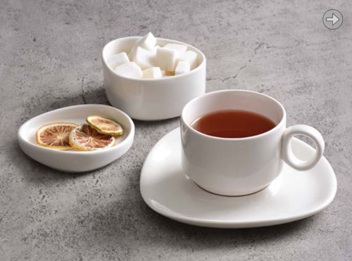
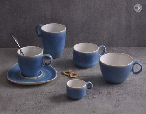
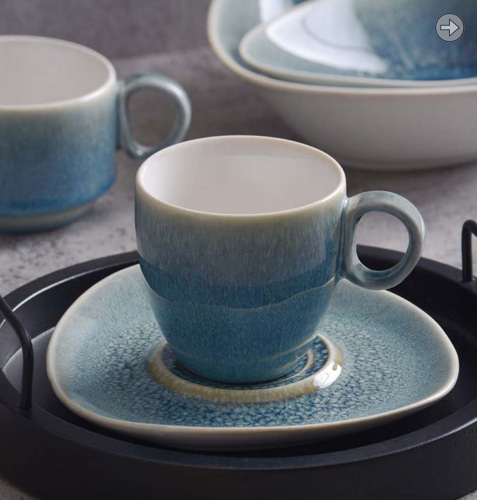
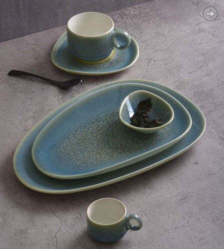
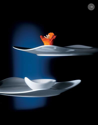
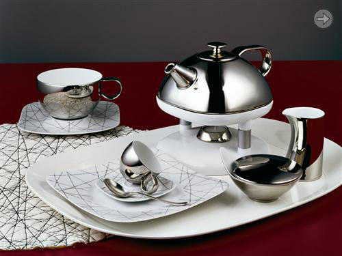
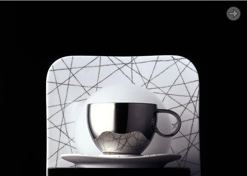
| Free Spirit was the table service to celebrate the 125 year anniversary of Rosenthal. On a personal level it was a hugely satisfying project with lots of time spent at the Creative Center in Selb with art director Robert Suk, refining and designing at top speed. We ended up with a very successful service, with an innovative play between porcelain and glass. Free Spirit has proved to be very versatile and seems to have had that bit of magic that has kept it at the front. It was awarded the title of 'New Classic' by Schoner Wohnen magazine.
|
|

| With Prince Buster we tweaked the shape of the successful King Tubby to make it suitable for rotational moulding technology. This gave us an outdoor version of Tubby. Design: PLATT & YOUNG
|
|

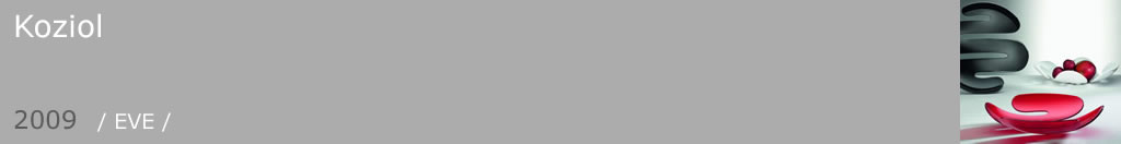
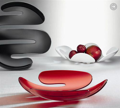
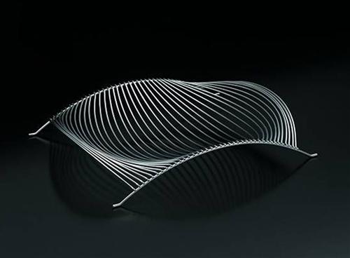
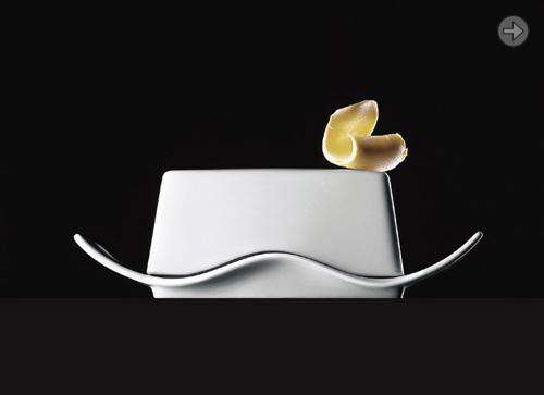
| This fruitbowl looks more complex than it really is. Actually there are only two elements: the side rail, and the bar that is swept along these two rails. Each of these bars are rotated a few degrees from the previous one, creating this flowing form. Design: PLATT & YOUNG
|
1/1 |

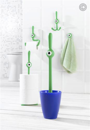
| Toq was one of those three second sketches that had such an immediate personality that it was bound to come to life, and it did. A walk around the Koziol factory and you can see it placed in a few strange places just keeping an eye on things! The family was extended to include toilet/kitchen roll holder, hooks and a loo roll dispenser. That's probably enough! Design: PLATT & YOUNG
|
|

| From the outset Yono was conceived to be an 'essential' table service. Not over complex or challenging in design, and also with a minimum of pieces. With a combi pot and a combi cup we already did away with the huge numbers involved by having coffee and tea as separate families. The plates and bowls were kept to a useful minimum, and we chose two sizes of tureen. Bingo! Design: PLATT & YOUNG
|

|

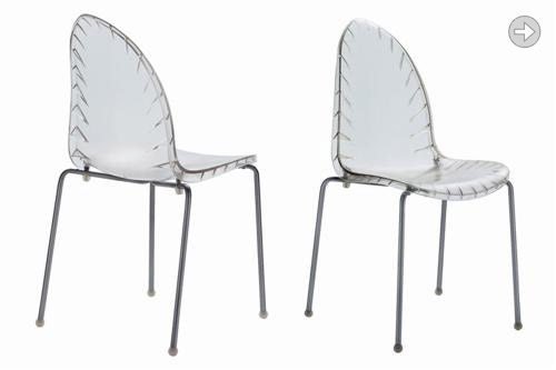
| Polypropylene stacking chair with an organic leaf shape. Later released in a clear ABS version. Design: PLATT & YOUNG
|
|

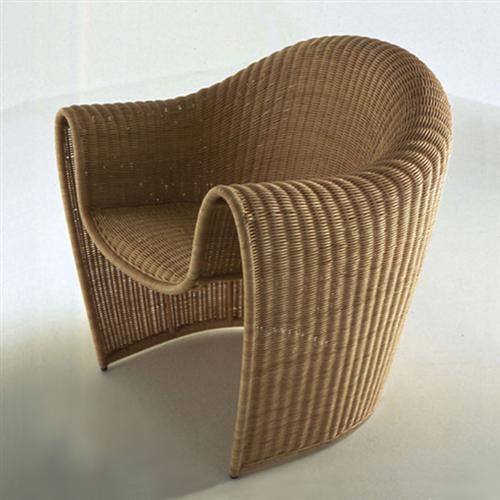
| This was one of those lovely projects where we made a 1:4 foam model with no particular thought as to eventual materials. Luckily the materials found the chair, as rattan was probably the only thing that could faithfully reproduce our shape. And so King Tubby was born. It actually scored a surprising top mark in strength testing. As my now ten year old version is proving, they will stand up to a lifetime of wear and tear. Design: PLATT & YOUNG
|
1/1 |

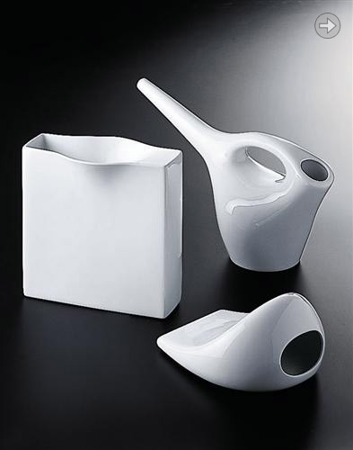
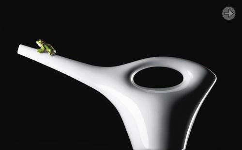
| With this project we were asked to look at objects outside of a dinner service, but still for use at a table or in the kitchen. How we got an indoor watering can in there I'm not sure! There were more pieces when first launched, but these are the ones that remain available today. Yet again another hugely enjoyable development process out in Selb. Design: PLATT & YOUNG
|
|

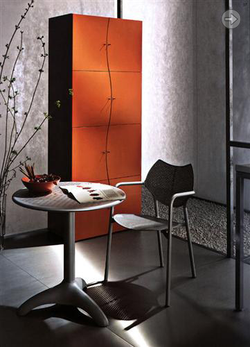
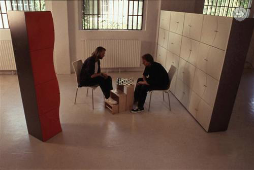
| This was a significant moment for us. Our first industrialized product. With just two door moulds one could create this full 'wallscape', or indeed just a single wavy column. Polystyrene proved to be more stable than polyurethane, and after some tweaking the doors were reliably accurate. We saw our first wall of Blister at the Cologne furniture fair and it was just so great to see what had previously only been viewable on a computer monitor in full and glorious reality. Design: PLATT & YOUNG
|
|

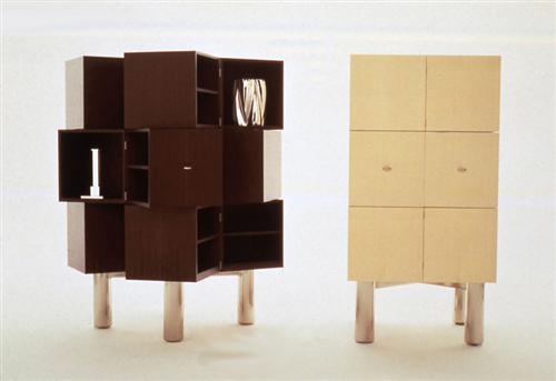
| This was one of those crazy ideas that only Sawaya Moroni would consider. We had worked out a way of hinging and spinning twelve boxes so that they all opened and shut simultaneously. The greatest satisfaction was watching people at the Milan Fair on the opening night, scratching their heads, looking between the gaps, on hands and knees looking underneath! Really good fun, and thank you William and Paolo! Design: PLATT & YOUNG
|
1/1 |

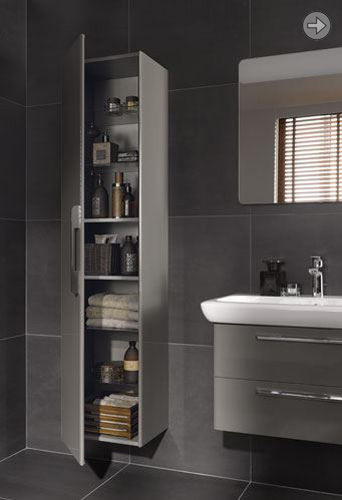
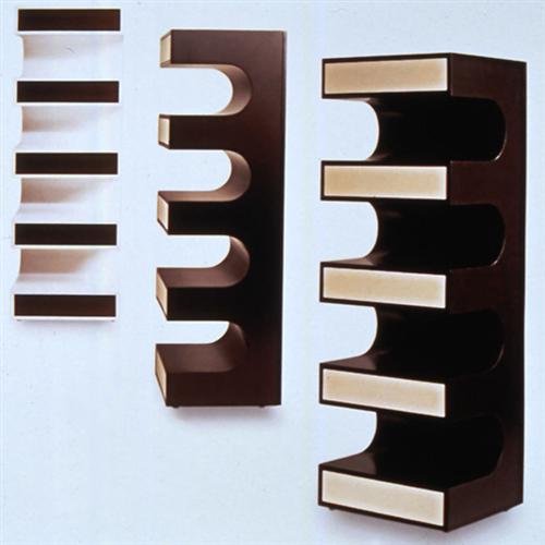
| A striking, and even practical storage solution. With five push to open drawers encased in fixed shelving, all of this cabinet is actually usable. Design: PLATT & YOUNG
|
1/1 |

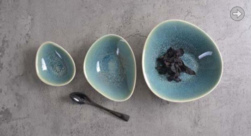
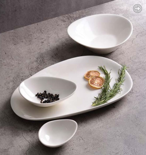
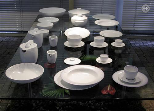
| This giftware collection was our first serious venture away from furniture design. We were invited to work on the project by Paolo Tumminelli, then Art Director at Rosenthal. Paolo moved on to his own great things, and we began our long and fruitful collaboration with the newly arrived Robert Suk. Many of the shapes are still in production today, and the two point bowl was a fantastic success. It made its own way from being just a giftware item, to being a kind of iconic restaurant bowl. This humble bowl was the starting point for the Free Spirit table service of 2004. Design: PLATT & YOUNG
|
|

| We designed this fruitbowl in mind of a plastic injection moulding. Nobody at the time was prepared to invest in the mould for this type of object, but Sawaya & Moroni were willing to try and make it in silver for their collection. It must have driven the craftsman completely nuts and has some fantastic pricetag attached! Nevertheless from our side it proved to be the catalyst that propelled us into product design. This turned out to be a good thing, so one could argue that this design, though not an industrialized big seller was actually worth its weight in gold (silver)! Design: PLATT & YOUNG
|
1/1 |